
The Good, the Bad, and the Ugly: Ranking the NBA City Uniforms
Save your money and don't buy the NBA City uniforms.
Throughout the past week, we've seen some leaks of the new uniforms that are coming to the NBA next season. Most of them are bad, and some of them are flat out horrendous. Let's take a look at the best and worst "City" uniforms for the 2020-2021 season.
THE GOOD
The Spurs 2021 “City” jersey has been leaked, via @camisasdanba.
— Legion Hoops (@LegionHoops) October 30, 2020
Thoughts? pic.twitter.com/lc5kxhcMv1
This one is probably my favorite. The black jersey works well with the throwback colors. It's not too in your face, and they didn't overthink the design. Sometimes simplicity is best.
The Raptors 2021 “City” jersey have been leaked, via @camisasdanba.
— Legion Hoops (@LegionHoops) October 31, 2020
Thoughts? pic.twitter.com/abcPKf4D7l
In my opinion, Toronto has come out with some of the best new uniforms in the past few years. Another Drake inspired uniform, with the black and gold looking very clean. Many might get annoyed by Drake's court-side antics, but you can't deny his OVO uniforms are fire.
The Grizzlies 2021 “City” jersey has been leaked, via @camisasdanba.
— Legion Hoops (@LegionHoops) November 1, 2020
Thoughts? pic.twitter.com/DCCLb11SuU
Love the Vancouver Grizzlies colorway. The best throwbacks in the game. Again, simplicity is best. They could've gone crazy with the teal, red, and black, but thank god they didn't.
THE BAD
The Suns 2021 “City” jersey has been leaked. (via @camisasdanba)
— Legion Hoops (@LegionHoops) October 29, 2020
Thoughts? pic.twitter.com/iFyYOz9Xi4
WTF is this Minecraft looking ass uniform? So much potential with the colorway, but they had to make it look like a two-megapixel photo from 2008. Definitely not the worst uniform to come out, but certainly not good enough to put it in the top tier.
The Mavericks 2021 “City” jerseys have been leaked, via @sga4mvp.
— Legion Hoops (@LegionHoops) October 29, 2020
Thoughts? pic.twitter.com/pVoWPsu5LA
Luckily for Dallas, they couldn't have produced worse uniforms than last year even if they tried:
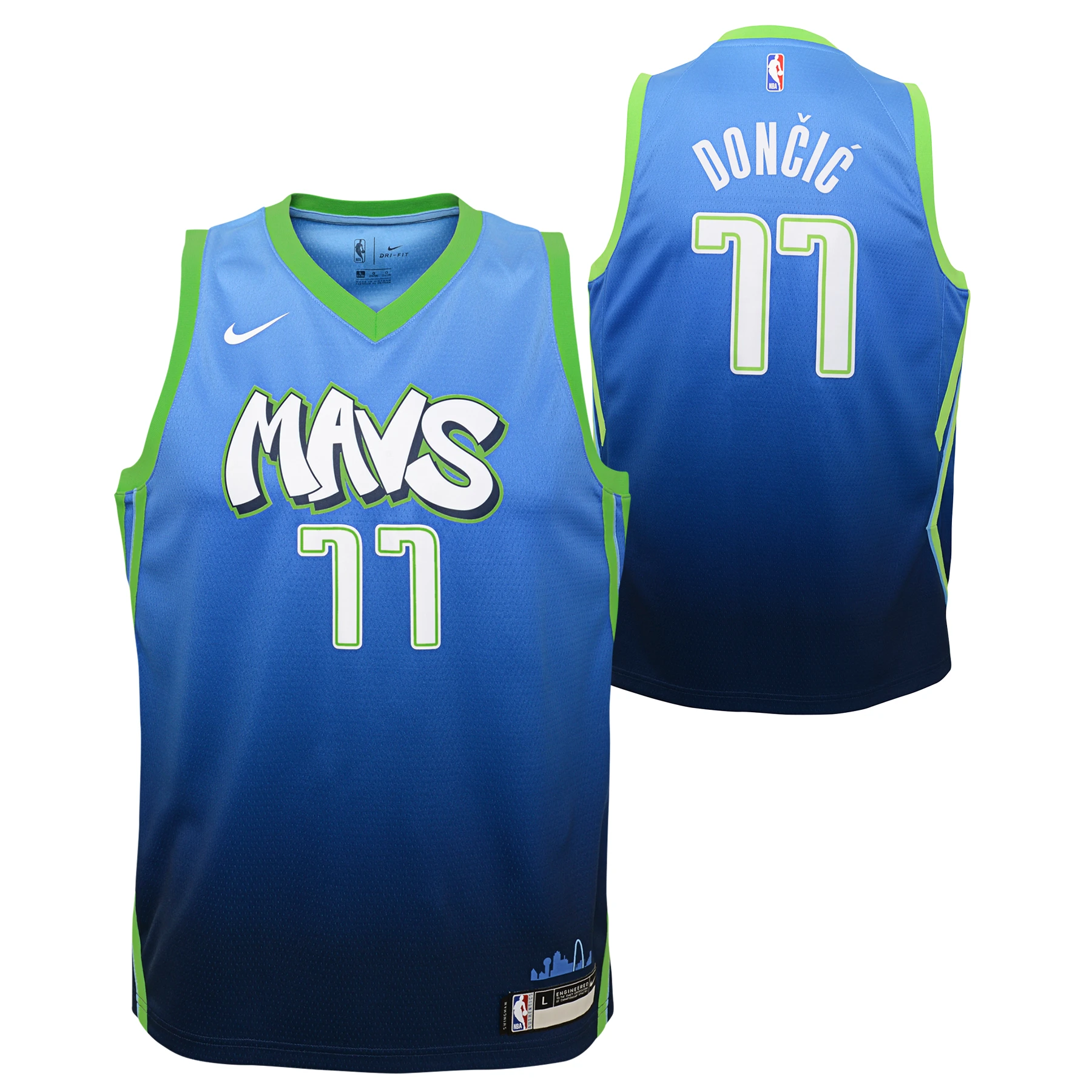
I don't understand the gold, white, and silver. If there's reasoning behind it, please let me know. Could've been in the good category if they stuck with their original colorway.
The Pistons 2021 “City” jersey has been leaked, via @camisasdanba.
— Legion Hoops (@LegionHoops) November 1, 2020
Thoughts? pic.twitter.com/WakgfevSWq
I personally hate logos with words that form a circle. A few teams have tried this in the past few years, but no one has been able to pull it off. It's a simple concept that looks bad because of the curved lettering. Let's try to leave this look behind after this season.
THE UGLY
If these are the actual new City Edition jerseys, the Knicks need to get over their obsession with creating a subway token logo
— Daily Knicks (@DailyKnicksFS) October 31, 2020
📸 @camisasdanba pic.twitter.com/bHrf0vpvVO
It's hard enough to be a Knicks fan because of the talent (or lack thereof) on the court. Now you're going to try to sell these to fans?! I wouldn't let my worst enemy wear these uniforms. Probably the worst ones I've seen so far. Whoever designed these should be fired immediately.
The Nets’ City jersey for the 2020-2021 season has reportedly been leaked.
— Legion Hoops (@LegionHoops) October 28, 2020
Thoughts? pic.twitter.com/b8roOIRWX6
How did NYC go 0-2 on new uniforms? Isn't the city known for being one of the fashion capitals of the world? The Nets literally gave a 2nd grader crayons to design this uniform. Unfortunately, they butchered this design considering the New Jersey throwbacks are fire. They're charging fans $100+ for something I could've designed in two seconds.
The Pelicans 2021 “City” jersey has been leaked, via @camisasdanba.
— Legion Hoops (@LegionHoops) October 29, 2020
Thoughts? pic.twitter.com/92GRmeKPVn
I might've lied when I said the Knicks have the worst jerseys. I mean, c'mon New Orleans. You're telling me that you're going to make Zion Williamson wear this?! Get a little creative with it. Their uniforms look like when you forget to do your homework and you bullshit it before class, hoping you can still get a passing grade.
Hounder Media Newsletter
Join the newsletter to receive the latest updates in your inbox.


