
How To Read Stock Charts Part 4: Channel Your Inner Guru
This time, I talk about the importance of channels and trends.
Channel your inner guru? huh?
I am referring to using price channels as a method of tracking stock prices.
Price Channels are lines set above and below the price of a security. These channels can be used to identify upward thrusts that signal the start of an uptrend or downward plunges that signal the start of a downtrend. This is useful because it allows us to see the general direction of where the stock is headed, providing possible entry and exit points.
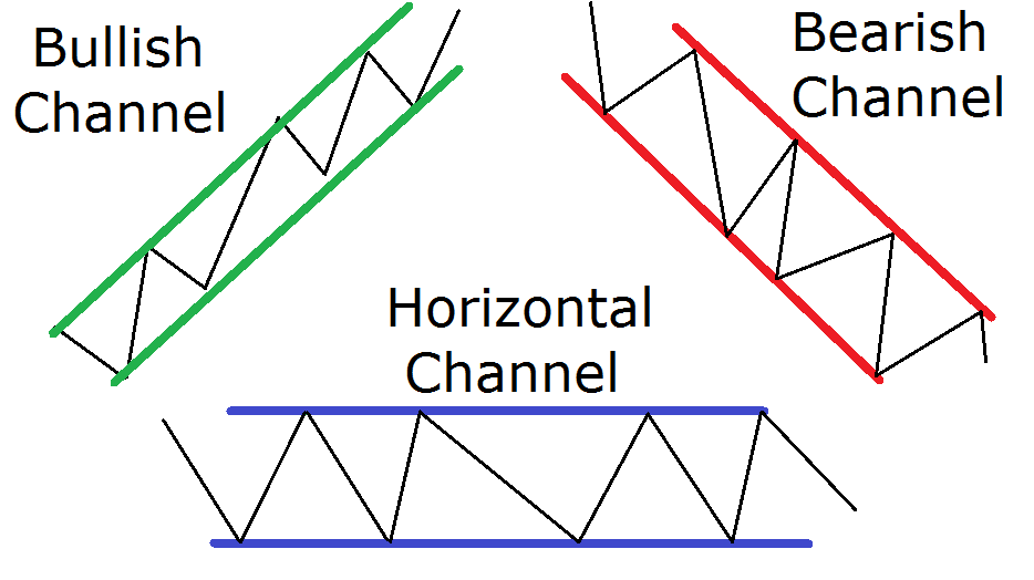
Channels come in three forms: horizontal, ascending, and descending. Descending channels are a form of technical analysis spotted commonly in uptrends and are considered bullish. Alternatively, ascending channels are often spotted in downtrends and are usually considered a bearish trading channel technique. This typically works best on stocks with a medium volatility, which can be important in determining the amount of profit possible from a trade. For instance, if volatility is low, then the channel won't be very big, which means smaller potential profits. Bigger channels are typically associated with more volatility, meaning larger potential profits. There's more chance for profit when things are going up and down frequently.
The trading channel technique often works best on stocks with a medium volatility, which can be important in determining the amount of profit possible from a trade. For instance, if the stock is not making much movement it means smaller potential gains. Bigger channels usually mean more room for profit opportunities because the price has more range.
When the stock breaks out of the channel, it can make for a strong entry point. The following chart below is an example of a descending channel.

See how the price action is trading in a range? It’s trending downward but it’s following a pattern. We see lower lows and lower highs, with the price staying in its own lane. Really, this is all just an easier way to visualize the movement of the price.
To be more technical, a channel is the combination of an existing trendline and an additional parallel line. Normally, the share price will shift between the trendline and the parallel line, enabling swing traders to create profitable trades.
As long as the price remains range-bound, traders can buy at the lower end of the channel and sell at the higher end. This is how neurotic day traders profit in the day, and this time frame can even be used for weekly/monthly swings for longer-term plays. For a deeper understanding of channels and their implications, check out some guidelines below:
Channel identification
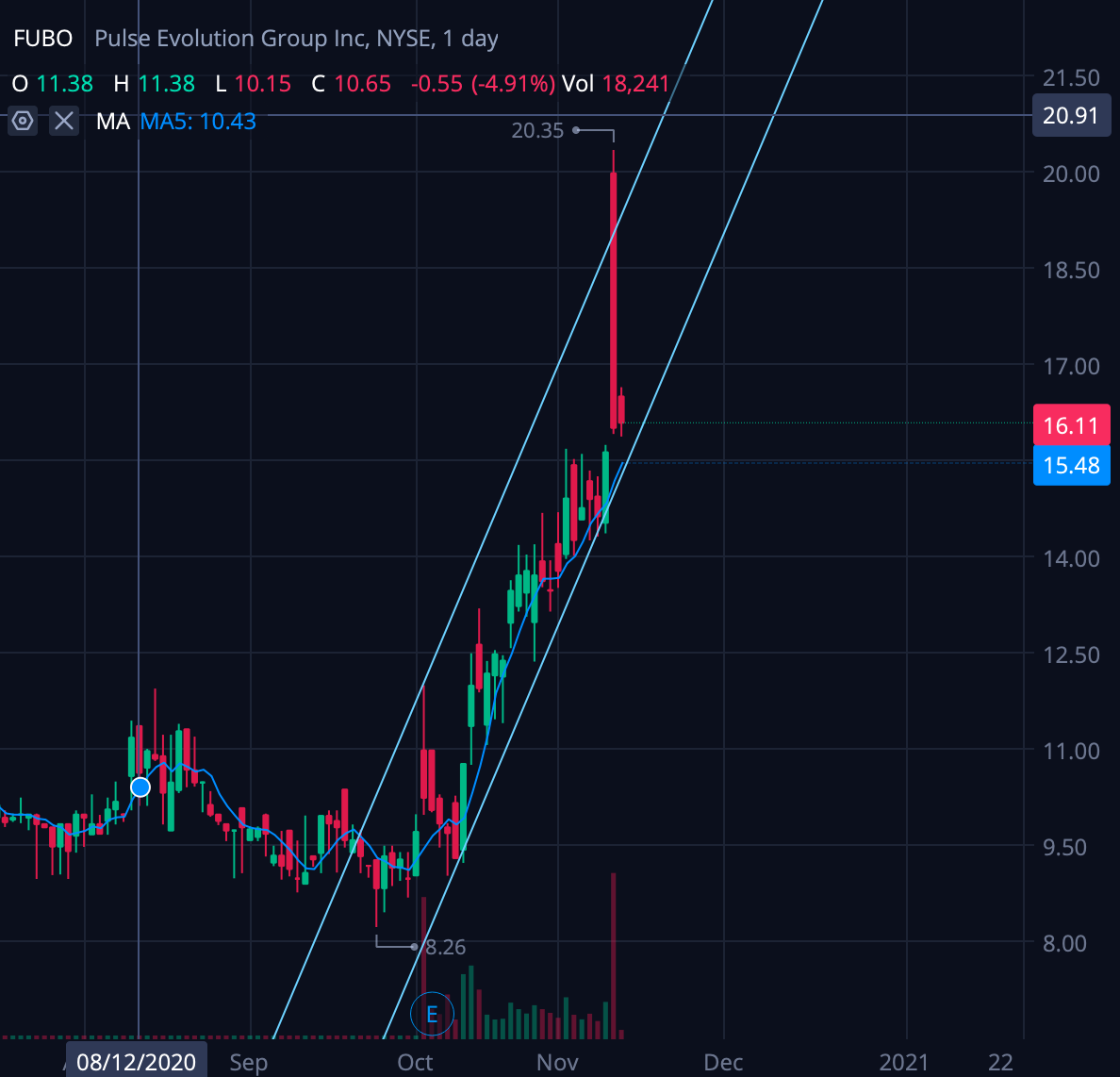
FUBO has shown an ascending channel over the past few weeks, and the price action suggests it will continue to follow this same channel. It’s going up and staying within the ranges of the channel. Channels like these can be traded by scalping, or buying during the low and selling during the high. It sounds easy in theory, but it’s much harder in practice. FUBO broke out of the channel (HA!) and is looking to consolidate in the 16 point range. I’d imagine it’s all the profit takers who made 100% of their money on this play.
Like trendlines, stock chart channels can be upward sloping, downward sloping, or horizontal. All three may even be identifiable. In the chart of HYATT, there are two blue channels. The existing trendline is the bottom line, and the top line represents a parallel channel line. Within this range, each channel offered multiple opportunities to profit. In theory that sounds nice, but honestly how the F will you know it’ll keep going up or it won’t just go down? I struggle with this too, obviously. The answer lies in the volume, look at how many giant volume bars, and how many times the stock created higher low points, following the channel. I think indications like that can be helpful, amongst other indicators that focus on momentum and support/resistance points.

Channel breakouts
A move through the channel line indicates the underlying trend is strengthening. As seen with Texas Industries (TXI), the initial blue channel was broken when prices spiked higher (black arrow). This developed a stronger trendline and is pushing the price of the stock higher. Sometimes it doesn’t work out and you end up leaving money on the table. If I could tell you when it was going to break in and out of channels do you think I’d be here right now and not in my lambo?

Channel trading
For very advanced traders, trading within a channel can sometimes lead to greater profits than simply trading with the trend. Scalping, which is the rapid buying and selling of a security, allows for greater profit margins than simply holding through the entire trend of a stock.
Successfully identifying channels is like driving on the highway. You see the direction you’re going and you follow the road. Sometimes exits can have funky swerves just like stocks can break in and out of channels. Like all technical analysis though, practice and experience are required to draw them cleanly. There are many false positives to keep an eye out for. Like most high school relationships, they won’t last.
Daily Moving Averages
Daily Moving Averages (DMAs) are like bread and butter to traders, the most commonly used indicator. Basically, a daily moving average is a line added to any stock chart that represents the average price of a stock over the last X number of days.
Traders use all sorts of moving averages. The most common is the 50 DMA, so a rolling line that displays the average price of the past 50 days. You would use this as an indication of whether or not the stock price will gravitate towards the moving average or if it will break new highs/lows to deter the average.
When reading a stock chart, moving averages can act as support or resistance. When a stock is trading around or on this line, it can tell you a lot about the stock’s price action and overall trend. It’s like rubbing off the make-up to see what the real deal is.
- Support – Let’s say we're looking at a company whose stock price has been increasing for some time. The stock has had so many up days that it hasn’t touched its 50 DMA for around three months. Eventually, the stock starts falling towards its 50 DMA, and one day it finally hits it, but immediately bounces back higher in price during the same trading day. What the hell? If you see this price action on a chart, it's because the 50 DMA acted as support for the stock. The DMA rejected the price going below it.
- Resistance – If a stock has been trading below its 50 DMA for some time, then starts to trend back upwards, the 50 DMA is often a point of resistance. This is due to its widespread use by investors and traders using it as an opportunity to sell shares for a profit. Remember, what you see is also seen by millions of other investors/smart money/basement dwellers (me).
As you start to watch stocks and look at more charts, add a 50 DMA, and take note. It is extremely important because whenever a stock trades at or around this line, it can foretell where the stock is going to go next. Here are two examples I found:


As you can see, the price is magnetized by that moving average, therefore it’s important to add it to your arsenal of indicators. No need to get intimidated by them all, take it easy and one step at a time! The market is not going anywhere and the more you are exposed to charts and lines the better you’ll do. Or not. This game is not for everyone.
**Not a financial advisor. Articles are opinions only.
Hounder Media Newsletter
Join the newsletter to receive the latest updates in your inbox.


